Use the data labels options to show or hide data labels, and to customize data label fonts, colors, formats, and more The Data Labels options are available for all charts, bubble and heat maps. To learn about shape map data labels, click here.

How to Customize Data Labels
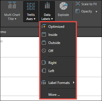
From the component ribbon, click the Data Labels button to add data labels to chart segments. Open the drop-down to expose customization options.

Optimized: Pyramid will determine the optimal data label settings.
Inside: place data labels inside the chart segments.
Outside: place data labels outside the chart segments.
Off: turn off data labels.
Right/ Left: move data labels right or left (currently only available for pyramid and funnel charts).
Label Formats: change the formatting for measures. You can choose automatic formatting, thousands, millions, billions, or the format of the measure in the data source.
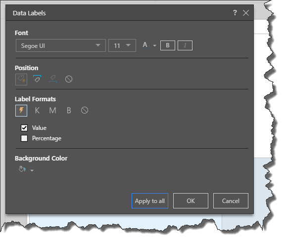
More: open the Data Labels dialog, where you can change the position, label formats, font, and background color.
Data Labels Dialog

Font: customize the data label font.
Position: auto position data labels, or position them inside or outside of the chart.
Label Formats: choose from automatic formatting, thousands, millions, billions, or the format of the measure in the data source. When working with segment charts and hierarchical charts, users can change the format to percentages.
Value: show the measure value for each data point.
Percentage: show the percentage of the total for each data point. For instance, if the measure is sales, display the percentage of total sales that each data point accounted for.
Background Color: set a background color for data labels.